Swiss Gothic
Visual Language + Design System
Swiss Gothic
Visual Language + Design System
The following case study shows the step-by-step development of a concept-based theme meant to establish a lockstep pipeline for all visual design within the Divine ecosystem.
Project Leadership
Visual Development
UI Design
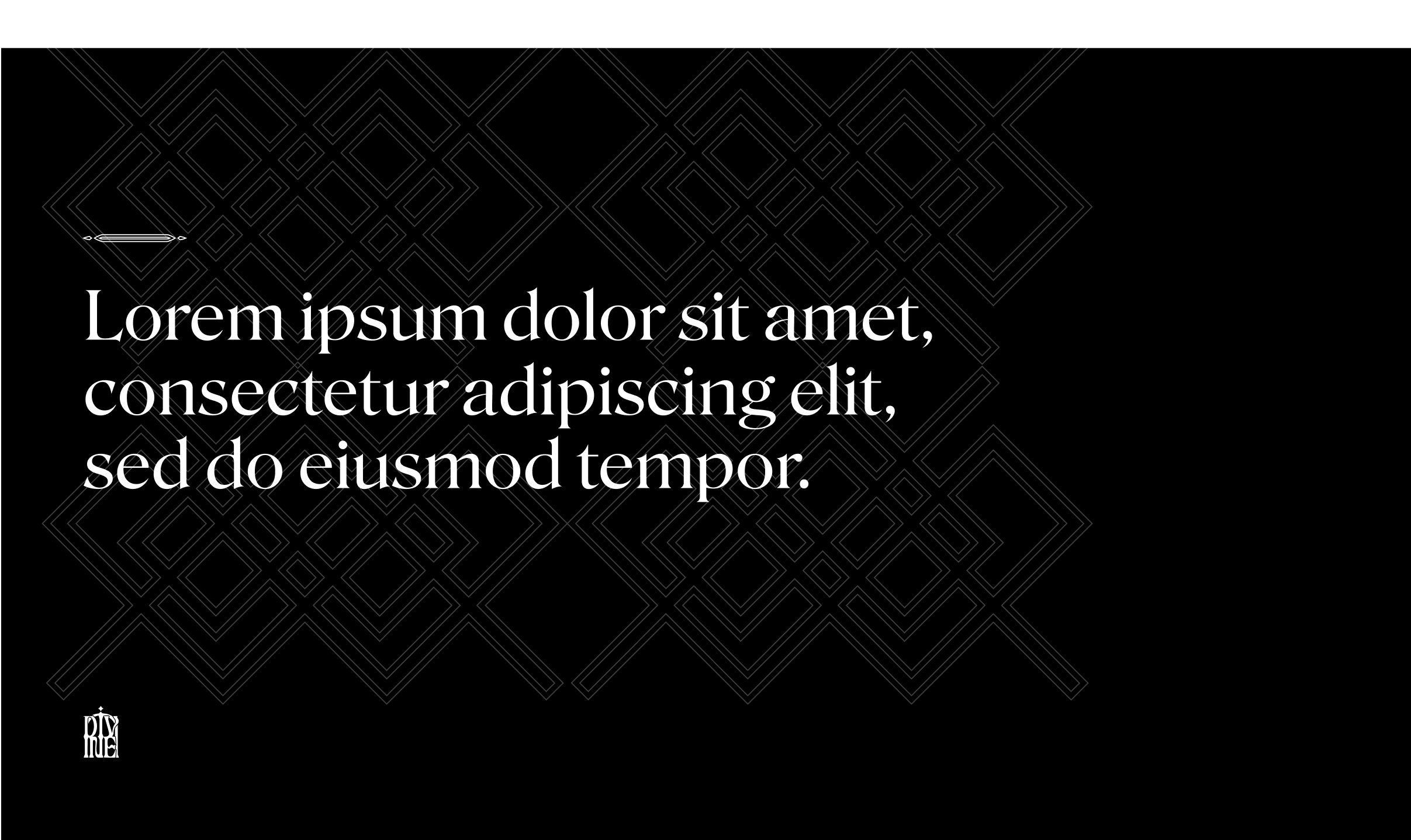
Swiss Gothic combines pointed archways, criss cross patterns and vertical shapes with stark surfaces, high detail embellishments, and generous white space. Visually stimulating with lore symbolism embedded within the architecture.


The overlaid white shapes on the text here are actual shapes pulled directly from the geometric combinations above. The forms in Roslindale matched almost 1:1 with these forms making it a great fit for the overall vibe.


At the beginning of the project we did a kickoff workshop to determine the overall vibe. After stakeholder post-it sessions determining the target audience, KPIs, and why the project should happen, we explored moodboards and opposing pairs of attributes that could inform the visual language. After this workshop we now had the What, Why, and Aesthetic verbally defined.
What is the goal of this project?
A library hub for decentralized media.
Why are we doing this?
To help jumpstart the Lootverse and create avenues for original IP development.
What should the aesthetic be?
A vibrant, geometric yet organic, minimal yet intricate, artistic, light yet dark, sci-fi yet fantasy, masculine yet feminine, realistic and serious look and feel. Obviously the aesthetic had a lot of work to do before it became actionable.

To get my mind around the aesthetic problem, I did a series of stream-of-consciousness concept sketches (the remainder of these are located in the Divine City section. This helped to establsh visual patterns that informed the overall look and feel.

I then arranged the various motifs into 3 defined concept categories:
1) Swiss Futurist
2) Intricate Gothic
3) Clean Roman
Each concept category had a basic geometry that defined the overall feel of the UI fonts, shapes, and patterns. I tried to manifest these shapes and patterns within a sample UI shape language that could be applied everywhere from web and social to game and HUD UI.
The form sketches directly informed the three UI shape language concepts. Fonts, elements, and object groupings were taken right from the sketches and interpreted into mock UI.


At this point, the team was torn. They enjoyed parts of each concept category and couldn’t decide where they wanted to go. Another round of synthesis was needed to make rubber meet the road. I brought the most interesting elements together and refined them to create the new and final category called Swiss Gothic, shown at the top of this page.
